
There’s no question: Andrew Krivine ’82 is a master collector. Pieces from Krivine’s collection have been shown at the Museum of Arts and Design in New York City, ADAM Design Museum Brussels, Cranbrook Art Museum in Michigan, the Pacific Design Center in Los Angeles and other university galleries. He recently wrote two books showcasing punk, new wave and post-punk graphic design: Too Fast to Live Too Young to Die and Reversing Into the Future.
Northwestern Magazine’s Jacob Arnold asked Krivine about how he got started, his holy grails, and his passion for punk-inspired graphic design. Krivine, who lives in New York City, also shares three favorite posters from his collection.
How did you get into punk rock?
Happenstance, thanks to family. I grew up in Briarcliff Manor near New York City. And every summer as a teen, I visited family in London, where my cousin John opened two punk clothing shops, Acme Attractions and BOY. I hung out at BOY in July 1977, soon after it opened, and became immersed in punk music and fashion. I returned home a convert and a budding collector.
What’s in your collection?
I have two storage lockers in New Jersey and one in the Bronx. These facilities contain more than 3,000 posters, 800 concert flyers and more than 400 fanzines. In addition, I’ve got clothing, stickers, hundreds of badges and scores of other promotional pieces, including standees, tour programs, press kits and promotional postcards.
For many promising bands the record labels would create in-store promotional posters, small easel displays and larger standees. These would be displayed for a few weeks before being junked or given to fortunate customers. One great example in the collection is for Blondie, promoting their album Plastic Letters. It’s nearly 5 feet tall and signed by the great Debbie Harry!
Do you collect records, too?
Years ago, I recognized that I had to pick a lane and focus on either vinyl or graphics. I just didn’t have the money to acquire everything, and as any record collector can attest, vinyl is an infinite black hole. However, I do have a modest collection of about 600 45s and 150 LPs. It’s basically what I listened to back in the day, between 1977 and 1986.
I was drawn to posters and related promotional graphic pieces because the best designs are so visually compelling. And there is a tangible, tactile dimension to all these works. Now we live in such a digital age — processing much of the world through small screens. It’s a different experience. People made this stuff without the benefit of software. These pieces chronicle the last burst of graphic design creativity before the digital age.
Is there a cool item you found after a long search — a holy grail?
There are a few holy grails. Through one of my cousins in England, I met someone who worked with the Sex Pistols’ manager Malcolm McLaren. I was able to acquire this woman’s entire archive — more than 40 pieces —mostly of Jamie Reid’s work. Jamie is widely acknowledged to be the most influential British graphic designer during the first wave of punk. He created all the Sex Pistols posters and graphics and introduced the concept of ransom lettering as the signature typography of the genre. Most people would have seen his posters and would recognize them instantly. His posters helped forge the visual identity of the Sex Pistols.
Another holy grail is a Joy Division poster from March 1980. I own some early reprints of this poster, but at most there may be 10 originals in existence. In 2019 I had an exhibition at the Museum of Arts and Design in New York, which then moved to the ADAM Design Museum Brussels. At the opening reception I met a collector, and after months of horse trading, we settled on a combination cash-and-trade for this poster.
Within three months of that 1980 concert, at the Plan K club in Brussels, Joy Division’s lead singer Ian Curtis had committed suicide. This was one of Joy Division’s last gigs, with the surviving members going on to form New Order.
What was your favorite discovery?
There was a legendary record shop in New York City’s West Village called Bleecker Bob’s. It had been there for decades and was on its last legs by the early 2000s. I went there two or three times over the course of about a month in 2007 and got to know the guys behind the counter. I bought a few posters that they had readily available, but finally I asked, “Is there a basement or attic in the building where you have a bunch of posters?” And they responded, “Funny you should ask. We have several more rolls in the basement.”
It was really a dank basement in this old Victorian building. Most of the posters were badly water damaged, but inside of one roll was a poster from an early 1977 concert for the Heartbreakers in Liverpool, England. Without question they’re up there with the Ramones — a hugely influential band. Concert posters for punk gigs circa 1976–78 are quite rare and can trigger a feeding frenzy at auction.
As a collector, you can’t let up. You must keep exploring. Even if you don’t feel like carrying on, if there’s one last tube, you have to open it up and see what treasures may be in store.
Can you share your favorite punk-rock relics?
Posters courtesy of Andrew Krivine
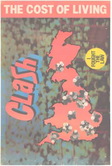
The Clash’s Cost of Living EP poster (1979)
[This poster] is a rare example of the excellent design work of Alex McDowell, who founded the [prominent punk and new wave] design agency Rocking Russian Design. Alex created a topographical depiction of the inflation-fueled economic crisis of the time by superimposing stacks of coins onto several major British cities. And this record includes what I consider to be the greatest cover song of all time, The Clash’s cover of Sonny Curtis’ ‘I Fought the Law.’
Posters courtesy of Andrew Krivine
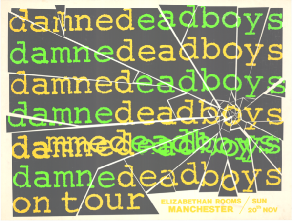
Damned/Dead Boys’ U.K. tour poster (1977)
In the fall of 1977 one of the great punk double bills toured the U.K.: the Damned from London and the Dead Boys from Cleveland. I [love] the shattered mirror effect, with shards bleeding into the poster border. I also appreciate the ordinary Courier typeface, which may have been a deliberate rejection of the ubiquitous ransom-style lettering associated with punk.
Posters courtesy of Andrew Krivine
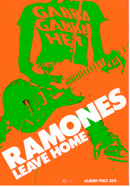
The Ramones’ Leave Home LP poster (1977)
The design elements [here] are perfect — an iconic image of Johnny Ramone on stage rendered in saturated neon green and orange. The color combination creates a visually pulsating effect that borders on the psychedelic, and Johnny’s stance with his Mosrite guitar reminds me of a soldier with a rifle slung across his shoulder marching across the steppes of Russia circa 1942. Great punk posters convey the essence of the music graphically — capture the sound in visual terms. This poster is a flawless example.

Reader Responses
Thank you for this great article.
Very timely, as today, February 7, 2023, is International Clash Day.
Happy Clash Day!
—Xiomara Brewster New Orleans
Awesome collection and story!
—Alex Shlaen '03 MBA, Singapore, via Northwestern Magazine
Ahhh, Bleeker Bob’s! I haven’t thought about that place in decades. Good times.
—Gayle Share '82, Philadelphia, via Northwestern Magazine
Thanks for this article and your work, Andrew, in the punk space. I’m a "punk mom" to Sasha Stroud, owner operator at Artifact Audio, NYC. Sasha drums in several touring punk bands, including Firewalker Boston Hardcore, Persona, Church Clothes, 80HD and Pretty. I too find the supporting artwork on album covers and posters remarkable in their artistry! Thanks again.
—Robin Stroud '92 MBA, Woodbridge, Va.
No one has commented on this page yet.
Submit a Response