Understanding Uncertainty

Two professors work to better visualize probability for the next election. By Clare Milliken

Image: Leslie-Anne Mock

Across the political spectrum, surprise was a common reaction to the 2016 presidential election. For most people, the predictions leading up to Nov. 8 made it seem as if Hillary Clinton was all but certain to become the first female president. Depending on your perspective, waking up on Nov. 9 felt like an icy splash of water or a thrilling upset. 

And some of that surprise, say Northwestern professors Jessica Hullman and Steve Franconeri, can be credited to the predictive charts and graphs used in 2016. Hullman, who holds appointments in both the McCormick School of Engineering and the Medill School of Journalism, Media, Integrated Marketing Communications, studies how data visualizations can help people understand uncertainty. Franconeri, a psychology professor in the Weinberg College of Arts and Sciences and director of the Northwestern Cognitive Science Program, studies how people process visual information.

These two researchers say incomplete or oversimplified visuals, paired with our human tendency to see what we want to see, contributed to the difficulty many people had in fully grasping the range of possible election outcomes.

Here, journalism, computer science and psychology collide as Hullman and Franconeri break down some of what went wrong in 2016 visualizations, and how data journalists can show probabilities more effectively in 2020 — and beyond — to better prepare voters.

Jessica Hullman
Journalism and computer science professor Jessica Hullman Image: Shane Collins

What went wrong in 2016

1. We saw what we wanted to see

“Our brains have a hard time understanding uncertainty,” Hullman says. People will often ignore that uncertainty, focusing instead on the most likely outcome.”

She cites as an example the FiveThirtyEight graphs leading up to the 2016 election. The solid red and blue lines showed Clinton defeating Trump by a narrow margin, but the wider, blurry stripes of color told a different story: Trump very well could win the election.

“The graph was actually telling us there’s a nontrivial chance that Trump could win, but people don’t know how to think about that,” Hullman says. “And so, people focused on the average prediction, or the most likely thing.”
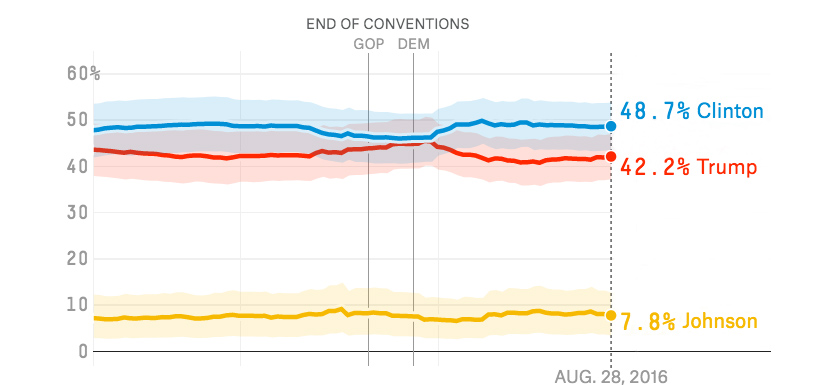
fivethirtyeight 2016 election projection graph

                  Image: FiveThirtyEight

2. Charts didn’t show uncertainty

“People tend to struggle with the concept of probability, because it’s hard to define what it is,” Hullman says. “There are great debates about how probability should even be interpreted. Some regard it as the frequency of an event in the long term, while others consider it the subjective belief about the chances of something. It’s not surprising, then, that people aren’t sure how to make sense of a ‘30%’ probability.” 

Franconeri echoes this concern. “To really understand probabilities, you have to be trained in statistics — and few people are. In the case of Clinton vs. Trump, many people saw the bar charts with Clinton at 70 percent and Trump at 30 percent, and they thought Clinton was a sure bet, because as a number, 70 is so much larger than 30. But that wasn’t the case at all.”

In fact, Hullman further explains, “The probability of winning is itself a measure that many people don’t understand well. A small difference in ‘vote share’ — or percentage of votes — can translate to a big difference between two candidates’ probabilities of winning. Research suggests that a key problem in communicating election forecast results is that they emphasize probability of winning over predicted vote share.”

fivethirtyeight 2016 election projection bar

Image: FiveThirtyEight

3. We tend to ignore margin of error

“Virtually no one pays attention to margin of error,” Franconeri says.

That can be attributed, at least in part, to our tendency to use mental shortcuts — like focusing on the most likely outcome — and also a phenomenon known as “motivated reasoning.”

“When people desire a particular outcome more than some other, they’re motivated to ignore probability information, which is murky by definition and therefore easy to discard,” Hullman says. “There's a long line of research showing people tend to be more certain than they should be about an outcome, especially when it’s an outcome they are personally invested in.”

So, in the case below, an Obama supporter would be apt to overlook the 3.5-percentage-point margin of error, which suggests Romney could in fact be in the lead over Obama.
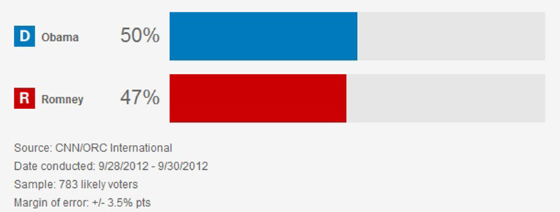
CNN margin of error bars

Image: CNN

“Every time we see data, we should be forced to see uncertainty — it should be intrinsic to how we visualize data.”

How to do 2020 better (hypothetical: Trump vs. Warren)

Hullman’s research has identified several ways to better visualize data and account for uncertainty going forward. And Franconeri has shown that a couple of quick fixes can help us overcome our own cognitive biases and make sense of a given visualization in seconds. Here, the two researchers, both members of the Segal Design Institute Research Council, use a hypothetical Elizabeth Warren-Donald Trump presidential election to illustrate those improvements, with Warren holding a 60% to 40% lead over Trump. (This scenario is purely illustrative; actual polls at the time of publication give Warren a much smaller lead in a hypothetical Trump-Warren showdown.)

1. Instead of a bar chart, use an icon array or a “risk theater”

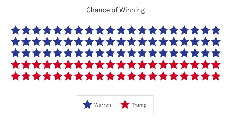
Unlike bar charts, icon arrays show individual election outcomes, making it harder to ignore uncertainty. Instead of a bar chart showing Warren at 60% and Trump at 40%, an icon array would show 60 dots reflecting a Warren victory and 40 dots reflecting a Trump win.

election 2020 icon array

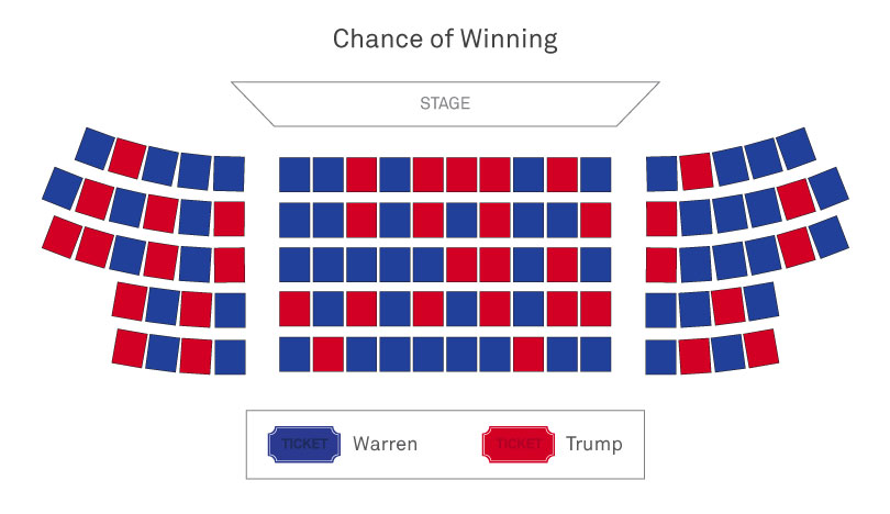
Similarly, a so-called “risk theater” would also make clear that Trump could very well be re-elected, despite his 40% to Warren’s 60%. With this visualization technique, it’s as if a person receives a random ticket to the theater. A blue ticket is a Warren victory, and a red ticket is a Trump victory. According to Hullman, this visualization goes a step further than an icon array because the viewer is asked to imagine “experiencing” an event with a given probability.

election 2020 risk theater

Steve Franconeri
Psychology professor Steven Franconeri Image: Shane Collins


2. Incorporate movement

“I think everything should be moving,” Hullman says, half-joking. “I realize most people can’t imagine a world in which every visualization is changing based on its uncertainty. But every time we see data, we should be forced to see uncertainty it should be intrinsic to how we visualize data.”

Instead of showing outcomes simultaneously, as in the Clinton vs. Trump bar chart above, outcomes could be shown over time by flipping a coin with “Warren” on one side and “Trump” on the other. Over the course of 100 flips, the coin would land Warren-side-up 60% of the time and Trump-side-up 40% of the time.

“Motion forces the viewer to refrain from picking a fixed outcome,” Franconeri says. “As soon as you think you know what’s going to happen, the display changes. That’s an intuitive way to convey uncertainty, because it mirrors how we notice probabilities of events over time in the real world.”

election 2020 coin flip

3. Clearly show people what they should see

Voters who want Warren to win are likely to look at a visualization and find evidence that supports a Warren victory. The same is true for Trump supporters. Journalists can overcome this “motivated reasoning” by describing the relevant point or points next to the data that supports it.

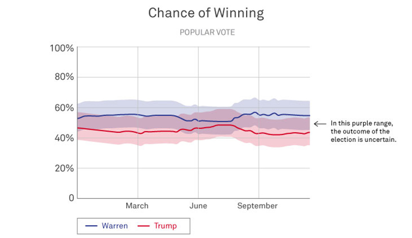
For example, in the graph below, by pointing out the purple overlap and using text to explain what that overlap means (i.e. the range of outcomes where the election outcome is uncertain), data journalists can prevent voters from drawing conclusions based solely on the outcome they want.

“If I were to say what all data journalists should do moving forward, it is to clearly show the key takeaways of a visualization,” Franconeri says. “Being explicit in this way makes it so much easier to communicate and help people understand the data you’re showing them.”

election 2020 chart

Of course, it remains impossible to predict who will win the presidential election in 2020. But by incorporating Hullman and Franconeri’s suggestions, journalists and media outlets can help everyone better understand the range of possible outcomes and make the most informed decisions, voting and otherwise.

Share this Northwestern story with your friends via...

Reader Responses

  • The other issue with polls is it is hard to capture the impact of the Electoral College and swing states on the election. A few points difference in Michigan and Ohio can change the whole thing.

    Rick Crago '77, Mountain House, Calif.,, via Northwestern Magazine

  • Thank you very much for this very thoughtful look at the 2016 election. The graph in part 3 showing "How To Do Better" is particularly striking in showing how we can overlook the range of possible outcomes from a poll.
    In your hypothetical scenario for 2020 — a Warren 60%, Trump 40% poll — you seem to imply in your icon array and risk theater that the "actual" probability of a Warren win corresponds to the figures in the poll, i.e., that a Warren win could be expected 60% of the time. Is this really what you mean to say or have I misread this?
    Wouldn't a 20-point lead in the polls, even with a 4-5% margin of error and a 95% confidence interval, equate to a much greater likelihood of victory? If candidate A leads candidate B 80-20, are you saying candidate B has a 1 in 5 chance of winning?
    This is quite at odds with Nick Beaudrot's famous "Myth of the Statistical Tie" argument.

    Jeff San Diego, via Northwestern Magazine

Submit a Response