What went wrong in 2016
1. We saw what we wanted to see
“Our brains have a hard time understanding uncertainty,” Hullman says. “People will often ignore that uncertainty, focusing instead on the most likely outcome.”
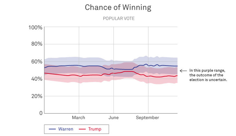
She cites as an example the FiveThirtyEight graphs leading up to the 2016 election. The solid red and blue lines showed Clinton defeating Trump by a narrow margin, but the wider, blurry stripes of color told a different story: Trump very well could win the election.
“The graph was actually telling us there’s a nontrivial chance that Trump could win, but people don’t know how to think about that,” Hullman says. “And so, people focused on the average prediction, or the most likely thing.”
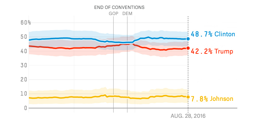
Image: FiveThirtyEight
2. Charts didn’t show uncertainty
“People tend to struggle with the concept of probability, because it’s hard to define what it is,” Hullman says. “There are great debates about how probability should even be interpreted. Some regard it as the frequency of an event in the long term, while others consider it the subjective belief about the chances of something. It’s not surprising, then, that people aren’t sure how to make sense of a ‘30%’ probability.”
Franconeri echoes this concern. “To really understand probabilities, you have to be trained in statistics — and few people are. In the case of Clinton vs. Trump, many people saw the bar charts with Clinton at 70 percent and Trump at 30 percent, and they thought Clinton was a sure bet, because as a number, 70 is so much larger than 30. But that wasn’t the case at all.”
In fact, Hullman further explains, “The probability of winning is itself a measure that many people don’t understand well. A small difference in ‘vote share’ — or percentage of votes — can translate to a big difference between two candidates’ probabilities of winning. Research suggests that a key problem in communicating election forecast results is that they emphasize probability of winning over predicted vote share.”

Image: FiveThirtyEight
3. We tend to ignore margin of error
“Virtually no one pays attention to margin of error,” Franconeri says.
That can be attributed, at least in part, to our tendency to use mental shortcuts — like focusing on the most likely outcome — and also a phenomenon known as “motivated reasoning.”
“When people desire a particular outcome more than some other, they’re motivated to ignore probability information, which is murky by definition and therefore easy to discard,” Hullman says. “There's a long line of research showing people tend to be more certain than they should be about an outcome, especially when it’s an outcome they are personally invested in.”
So, in the case below, an Obama supporter would be apt to overlook the 3.5-percentage-point margin of error, which suggests Romney could in fact be in the lead over Obama.
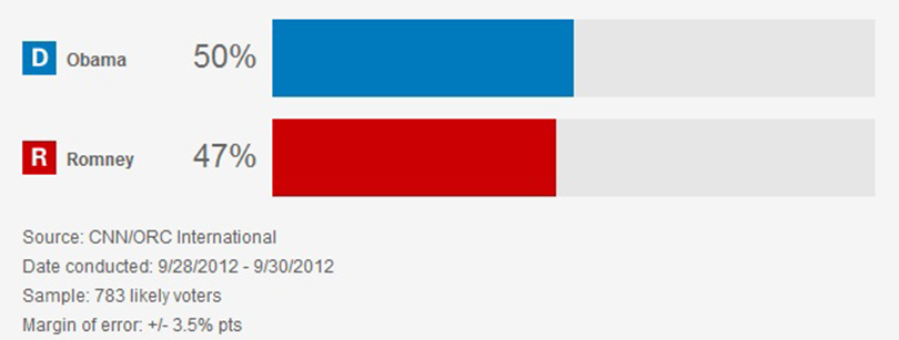
Image: CNN



Reader Responses
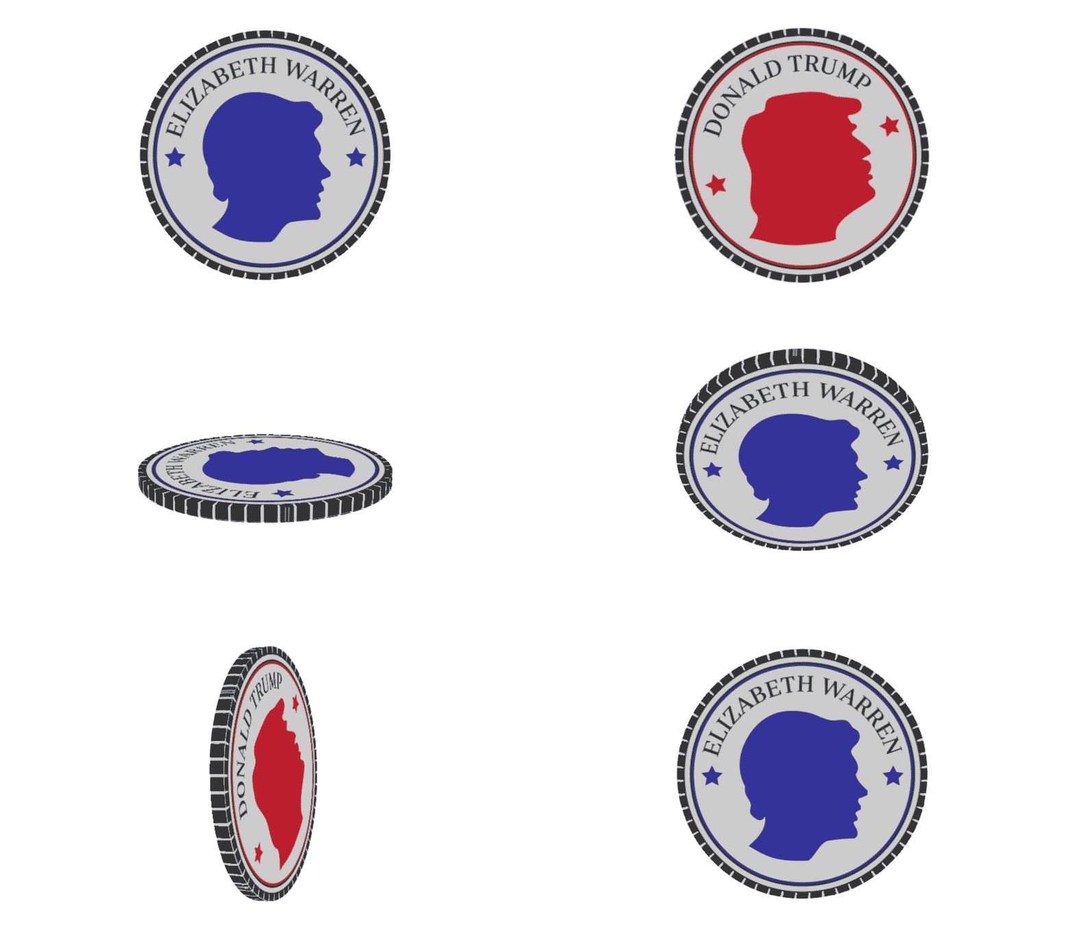
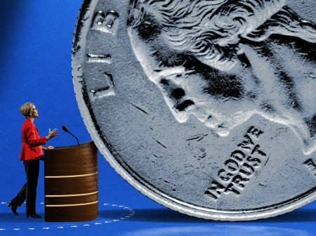
Is this a drawing of Elizabeth Warren or Hilary Clinton? Can't tell.
How to predict better the outcome of an election is the bleeding obvious, no research needed. You have to poll a sample of people who represent accurately the entire country, even the people whose opinions you do not like. In 2016, the media, mostly far-left-wing, such as NPR and PBS and some universities, polled their audiences and got the answers that they wanted. But they were the wrong answers. The question is, will the media do things differently in 2020?
—Rosanne Kosson '84 MS, Falls Church, Va., via Northwestern Magazine
It is far more important to HAVE better elections.
We actually have the elections.
And like sports games there's a reason for that.
Despite the amount of time and energy invested by the media in predicting the winners (take for example Super Bowl Sunday - far more time in pregame coverage than the actual game) we still play those games.
Now if we could HAVE better elections, where everyone has the opportunity to participate and there is no interference by other countries and votes were tabulated in a way that gave confidence to the voters, that would be something worth accomplishing.
—Philip Orem '81, Arlington Heights, Ill., via Northwestern Magazine
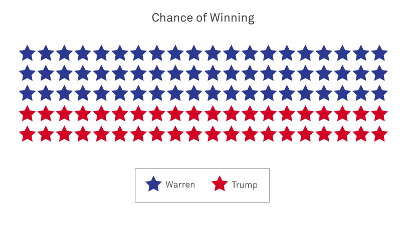
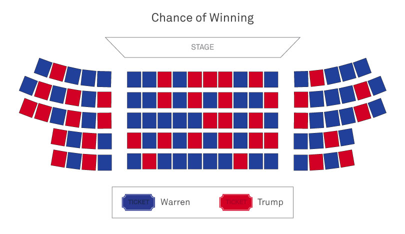
As a graduate student studying public policy and currently enrolled in a statistics course, I found this article enlightening and was reminded of the importance of understanding and accounting for things like margin of error. I also found the use of charts to be especially helpful. For example, the Clinton/Trump bar chart compared to the Warren/Trump theater chart instantly changed my perspective. I will definitely be revisiting this article throughout the year as new statistics emerge.
—Lauren Evasic Chicago, via Northwestern Magazine
In response to Jeff's comment, the “popular vote” text in section 3 was only intended to imply that the graph showed “the chance of winning the popular vote.”
—Jessica Hullman Evanston, via Northwestern Magazine
Tom Wolery's response is right on — bad data. Today many voters feel that polls are an invasion of their privacy, and they lie when they respond.
—Robert J Hummel '57, Lake Geneva Wis., via Northwestern Magazine
Consider adding several notes on sample bias: People who answer are not always forthcoming especially when “firsts” (like black or women president) are at stake; and there are many who decline to answer. These make even the uncertainty value uncertain.
—Mark Kilduff '06 MS, Rolling Meadows, Ill.
I enjoyed the article and the focus on how we assimilate data. The only problem is the authors assume we are dealing with truth. Most of the time, truth and fiction are blended together so tightly we are unable to separate the two.
—D. Haydon McDonald, Tenn., via Northwestern Magazine
The huge volume of robocalls are increasing polling uncertainty these days because the people sampled will be mainly partisans. Most other people won't answer their phones if they don't recognize the number or caller ID. And who but a partisan really wants to be polled, anyway?
Telephone polling is a dying business. Use social media instead? Well, there come the partisans for sure.
—Thomas Wolery '78 PhD, Livermore, Calif., via Northwestern Magazine
The problem isn’t one of data visualization, but rather one of bad data. The “shy voter effect” swamped out traditional poll uncertainty (which is more a function of sample size than respondent truthfulness). We see this all over the world — conservative wins in Australia, the UK and elsewhere; Brexit. The political and social climate of recent times has likely made this effect even larger. So I don’t see how risk theater, or different icons, help reduce surprise, as the underlying issue seems to be accuracy of the polls themselves.
—Berni Bourekas '96 MEM, Las Vegas, via Northwestern Magazine
Excellent article! For a visual learner, this is a concise way to show, ironically, the PURPLE, or the uncertainty that often is downplayed by the media during elections. Go Cats!
—Paul Silverman Franklin, Mich., via Northwestern Magazine
1 2 next »
No one has commented on this page yet.
Submit a Response